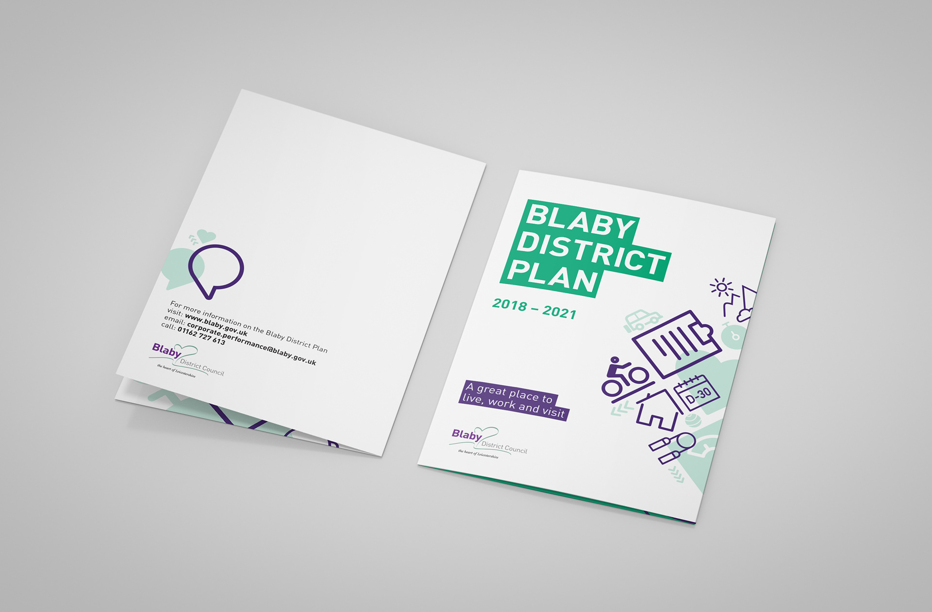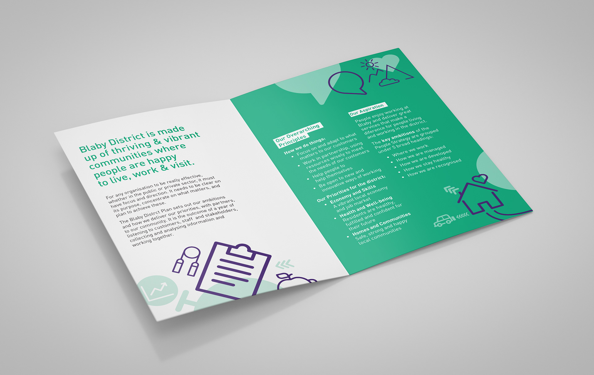

Corporate Branding re-design - 3 day brief Blaby Council takes a great deal of care in looking after it's tight knit community. Collateral was cluttered, confusing and needed reinventing. A new look and feel for branded roll-out was created using the strict guidelines of one typeface (DIN Pro) and a two colour scheme derived from the already established identity. The use of a highlight was utilised throughout to reflect the message of always identifying the best and most important information & services for community in Blaby. The simple line illustrations give a more contemporary and friendly feel to the designs and help to illustrate the topics covered in the collateral without being overpowering.

